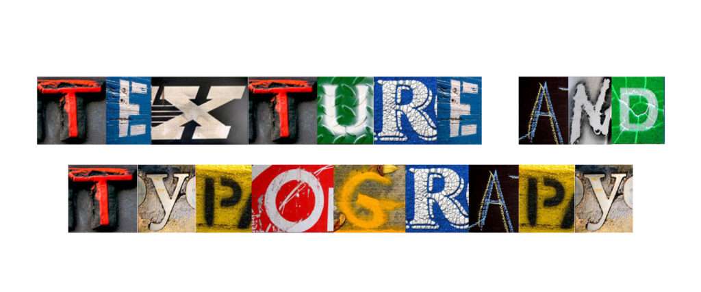
Hey guys, welcome to another post! Today we will talk about how texture and typography play a role in your design education. More like how it was for me, but we learn from each other’s experiences don’t we?
Textures are a very essential part of my work as an industrial designer. Typography? Not so much as yet. I recently learnt about interaction design, so I can say I am still learning rapidly about how typography works and how I can make use of them in order to make my UI projects more interactive and effective. So let’s take a look at how these two elements work.
Texture
- Texture is the surface perceived visually or through touch. This term, however, is not just limited to that.
- Texture is often used to describe the quality of sound, especially voice quality.
- Anyhow, in design, this is an especially important aspect to consider in order to define and manipulate user experience while handling the product, whether it be digital or a tangible one.
- Often in digital products, textures help create a more three dimensional immersive experience.
My first dalliance with texture started in my first year with creating visual textures freehand. We could use absolutely anything, drop ink on them, scrape them across the paper and voila! You get the nicest, weirdest two dimensional textures out of anything. Point is, these objects have irregularities on their surfaces that gives them the texture they have.
Examples of Textures

There are no limits of what one can do when experimenting with creating textures. So scrape away with that leaf or that fun tile you found on your terrace! Clay, thermocol, sponges, all are excellent surfaces for you to try creating 3 dimensional textures too.
Typography
Now this is the part that even I am shy of covering. Unlike other elements, exposure to typography comes after you have covered more basic terms. It is a specialised discipline by itself and foundries are where typographers work exclusively to produce and distribute typefaces.
As of now, we will talk about the very basic lingo this aspect of design uses, as well as what to do with it.
- Typeface : This a family of characters in multiple font options. Often people use the terms font and typeface interchangeably. However they are wrong to do so. When people say font, they often mean a typeface, like say Arial or Times New Roman. We will learn what font is directly.

- Font : Font is the style in which a typeface is used. It depends on the typeface how big the family of fonts would be. These are the naming conventions of fonts :
- Weight : Hairline, thin, ultra light, extra light, light, book, regular, semibold, bold, extra bold, ultra bold, black, ultra black.
- Width : Compressed, condensed, semi condensed, narrow, normal, extended, extra extended, expanded.

There are of course many other naming conventions for fonts, but for a beginner this is good to start with.
Often typefaces are dubbed font families. There are also type families of related typefaces, usually covering sans and serif. However these are things you will learn when you go in depth in the study and practice of typography.
When learning about typography, from my own experience and current practices, I would suggest reading up a lot regarding different categories of typefaces and type families including people who have contributed a lot into the world of typography.
Properly used typography can make your work pop out from the rest in terms of how well it goes with the theme of your project, your personality and even the way you carry yourself. Once you do that, people start taking your opinions seriously because a well designed portfolio speaks volumes about the person it is meant to represent.
Takeway
Textures and Typography are another set of basic elements that a design student would need to learn using, in order to be able to incorporate them in your work. While they might often be used in different contexts usually, there are endless possibilities in design where you can incorporate one in the other and make your work unforgettable. I am still learning every day, every moment and these little things are often things that teach me a lot about the human mind and how it perceives things. This is important after all, since design is often user-centric. Next up is a small study about scale, dominance and emphasis. Till then stay tuned!